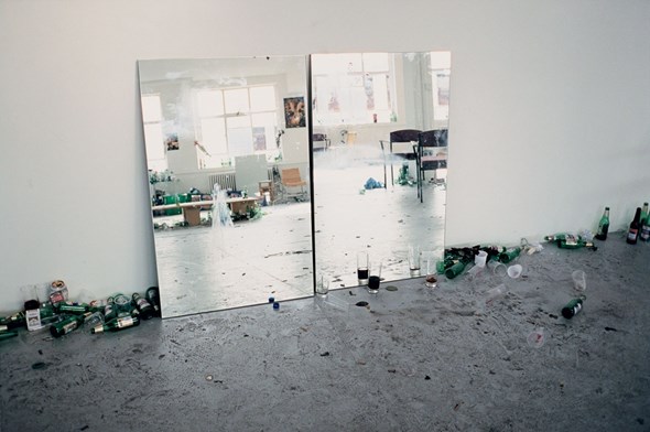
Rita Vitorelli: Let’s talk for a moment about the title of your most recent book truth study centre.
Wolfgang Tillmans: I’ve always liked the names of research institutes and I like inventing them, too: some sort of name for a hypothetical research institute. Behind that is a playful pleasure in phonetics. Institute for Geodesy and Photogrammetry. I always found that very attractive. Sexy. The neutral position you have when you know nothing. Actually nobody knows what the result of the research will be, and yet we give it this authoritarian, neutral name. We are, after all, the authorities in this case.
Truth is the subject of study in your fictitious study centre?
(laughter) Well, that is a research institute that doesn’t exist and something that never will exist. But it’s something that would be needed. The fact is that I have noticed in recent years that this idea of truth is coming closer and closer to the centre of things. After the 1990s, which seemed to be such an undogmatic time, people are suddenly demanding “Truth” again.
Who are you thinking of in that context?
Islamic fundamentalism or the South African President who denies that HIV causes Aids. Or the fact that Blair and Bush didn’t accept that Hans Blix found no Weapons of Mass Destruction in Iraq. That a large number of themes that concern us from day to day have their causes in different definitions or interpretations of truth. We suffer because other people have laid claim to truth for themselves. By contrast, I find scientific relativism extremely attractive. The evidence of how things appear has to be taken on board somehow at the very least. That the visual appearance of things also creates the facts. For example, in my own case homosexuality is always a good test for finding out a great deal about people’s willingness to look reality in the eye.
The question is, what one can contribute as an artist toward the discovery of truth.
Yes, exactly. The book title is not a promise that I can find that out or that I hold up my truth as something fixed. It is also recognition that the work of an artist cannot perform the work of a research institute. I was more interested in the poetic possibility of setting this concept in the centre – Truth. And to do this against the background that we also have to take it over. You can’t simply leave it to the Pope and Al Qaida and Bush. The word Truth is like a hot potato. You don’t want to make a grab for it; as a cool person you would prefer to stay away from it. And that is always the problem: that unscrupulous people squat right down in the middle of it. For me it was important to help take over this word.
So the book title intends to give the work a certain push?
It wants to provide a side-thought, an auxiliary thought. What is in the morning paper will also affect the way you read the book in the evening.
And the blank sheets every now and then, what is their purpose?
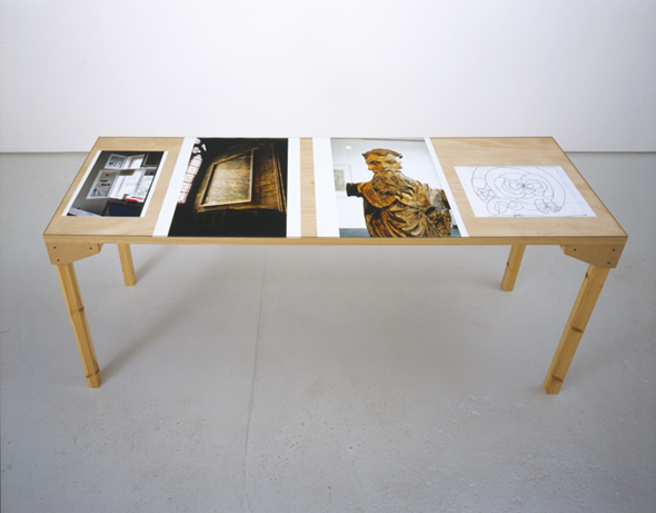
That is a design level, simply to break up the rhythm. Sometimes it simply looks good if there is an empty page on the left. That is one of my main design principles when I’m making books, because I am actually very strict about the layout. People also ask me why the books don’t look like the exhibitions. But in my opinion they do: in the way they are sequenced they are similarly clear and unclear, like the installations. And then, there are experiences and expectations. For example, you don’t expect the right-hand page to be blank with a picture on the left-hand side. If the right side is blank on one double page and the left one on the next, you suddenly have a white page in your hands. All of my work takes place on paper. Everything I do is ultimately paper – with the exception of the new exhibition, which is paper and tables and glass. I am simply interested in paper as a material. I have even taken photos of photo paper.
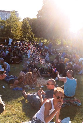
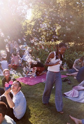
There are various formats for one work or one subject.
Every work is an edition by itself. The edition with the dimensions of 40 x 30 cm is a “different” work from the one with the dimensions of 50 x 60 cm, because it then “does” something different. I start with the object. This sheet is this size or that and consequently has an effect that is different from that of a smaller sheet with the same motif.
But you see them as single works, or are the wall installations sold as a whole?
Yes, that happens, too. Well, I don’t see it as a necessity that the wall installation has to stay together in its given form in every case, but there are central walls which are as they are, a work in themselves, including a title.
When do you decide what you need in what size for the large-scale installations? Is there some sort of starting point?
In some cases I choose them in advance, thinking about the city, the location, the gallery and the connections. On site I can then see what is important to me in this or that place. The size is then a formal matter, with the formal concerns being no less important than the subject matter. A small picture can be just as important as a really big one. The decision to show it so that it looks good, that the colours are right – those are not superficial questions but have something to do with the way you talk. Either you speak clearly and well, or don’t.
But in principle each motif would work in all sorts of formats?
No. I found my formats in 1992 or thereabouts, from experience. And I have always remained faithful to the basic grid. There are photos of 10 x 15 cm where I see the pictures for the very first time, as they come from the laboratory. Then 30 x 40 cm, 51 x 61 cm and about 535 x 210 cm. That is the basic structure – which I then produce as editions of 10, 3 and 1. And the big format exists both as an ink-jet print and as a framed C-print.
Why?
Because both are in turn so different in their material quality, and I find both interesting. In 1999, when I introduced the framed C-prints, I was interested in simply doing the opposite of what I was known for, namely the ink-jet prints on clamps.
Do you notice a trend? Does one work better than the other?
There are people who see the ink-jet prints as more typical. But many don’t like to take responsibility for this frail object, where you have to be careful when you open the window, that a gust of wind doesn’t rip it from the wall. And so there are people who prefer to have a solid presence. For me the important thing is the purity of the object. This sheet interests me. In the exhibition I came to a point where I wanted to take away everything that put the sheet on a pedestal. I wanted to be able to experience the sheet as a sheet. I then invented a special adherence technique … You can keep that for three or six months, that purity in space, but when it has been hanging on someone’s wall at home for five years and he smokes or there are flies in the apartment (flies settle on pictures, for example, and shit on them), the dirty sheet has less of the purity of the object than when it is protected in a frame I chose for it and where it can, hopefully, remain for many years. But in fact everything passes. That is also what is special about photographs: that they come into the world as this extremely perfect object and are always at risk from that point on.
Now about the way you hang things. You were the first to present photography like that. Why did you do that back then?
Like so many things that are fundamentally new, it didn’t feel like that at the time. Not in the way that I might say now I’m going to do something revolutionary. Of course a certain spirit, a certain mood and will of mine was involved in that. But I believe that most things that have new force come about not because you have that intention, thinking in advance about how it is going to be received, but because there are certain reasons for it …
That is something like a lucky moment.
Yes. Of course I can be pleased that it came to me, but on the other hand it is of course the case that I made many little important decisions at many points, and that led to what ultimately resulted. For example, I simply rejected the existing hierarchy between magazine pages as throw-away objects and manually processed photos as objects of value. But not in a mere reversal, but rather in a conjunction of the two: both have special haptic qualities. That was definitely a conceptual decision. Whenever I designed magazine pages myself, which I was able to do for i-D in 1992, 1993, those pages were fully authentic works as far as I was concerned.
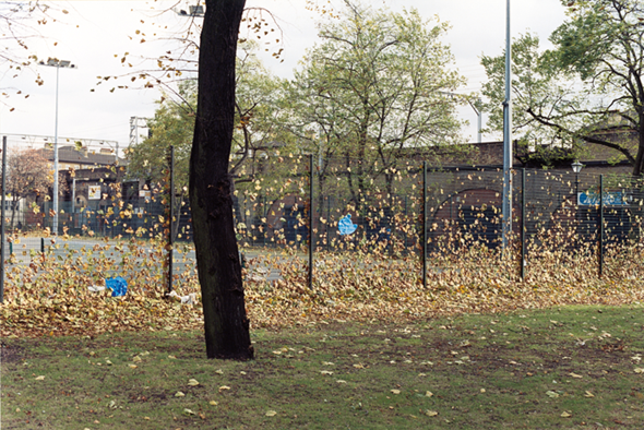
How large was the conceptual share in your work. This reminds me of strategies in the 1960s, where the aim was to be as unhierarchical as possible with all sorts of materials, trying to pull down the hierarchies by sticking or pinning them to the wall, etc.
There was a huge intuitive consciousness for that. The fact that one only buys a wall drawing with a certificate was something I was familiar with. When I chose ink-jet prints (at that time they were large-format colour photocopies) as medium in 1992, I saw a conceptual solution in them from the very beginning; in particular, that I can travel to some other place with these small original photos and make a big exhibition there. Which I even did in the early years.
That is a practical economy of resources.
Yes. Precisely, that is something that still goes with me today, a pleasure in photography as an economical resource that helps make it possible to think about space and objects. A lot of my work is actually three-dimensional. That protects me from having to make all sorts of unnecessary objects and casts, replicas and things. (laughter)
Was this conceptual aspect even noticed?
There was so much happening in the pictures in terms of content that all this conceptual thinking was not noticed by critics at all. The people who concerned themselves intensely with it liked it and found it interesting, but to this day it does not determine the way my work is seen. Of course people know that I have gone through all possible models for “pictures in space”. But it is interesting that in the case of photography the subject is always absolutely in the foreground and people actually don’t think much about the object. And the object is made insignificant in many photographs because it is pasted up, placed in a borderless frame …
One thing I found very interesting was that you see the journal works as editions, but simply as much bigger ones. I really find that funny. When I read that back then, the process, the way of dealing with the thing really interested me. The approach to the picture and to the subjects themselves corresponds to each other very strongly in terms of attitude – because the way I see them your works are extremely unpretentious.
Precisely, because this kind of action, making a picture of something, needs in the first place to be severely questioned. Why? What’s it all about? What added value can I provide? What is the meaning of this act of changing a real object into a two-dimensional one? I think it was very good that I had a wonderful teacher when I was a student, who conducted the course with pure psychoanalysis. He always basically asked why you think that you have to contribute something more to the huge quantity of pictures that already exist.
Were you able to find an answer for yourself?
No, it’s not a question that demands an answer in the classical sense, although, fortunately for me, I had the feeling that large numbers of things were not represented the way I see them. For example, taking photos of my peers as I see them, as complex persons, both serious and to be taken seriously. Which was simply not the case in the media at the end of the 1980s.
That would be portrait photography with a tradition as long as photography has existed.
But young people were not photographed in that way at that time. Today, of course, there are 20,000 portraits of young people and the scene.
But there were people like Nan Goldin, Larry Clark…
They were much, much earlier, two decades earlier. Nan Goldin started in the 1970s..
But Juergen Teller, ok, more in fashion…
I mean the idea that things like House Music or disco could be something serious simply didn’t exist in the world of art. That is why I was interested in i-D. As a teenager, on the one hand as a Boy George fan, and on the other as an artist, I always noticed that, something which is not completely new, of course. Andy Warhol also started up his own journal. But this allegedly ephemeral aspect of culture was really not represented in art. And yet I experienced profound truths in a disco night and was able to think about abstraction in disco lights and the fall of textiles. All sorts of so-called high art themes were perfectly evident to me in subcultural contexts. That was not represented in the world of art.
But your work did fit into the crossover trends of the 1990s. Otherwise that would probably not have worked – if there was not a larger context in the air, in visual art I mean.
Absolutely. I am very grateful for people like Nan Goldin or William Eggleston, who were the first to make colour photography possible as an art form. One should never forget that colour photography was in itself a no-go area in art at the end of the 1980s. Cindy Sherman also has to be named in the front line. And I was lucky to be born later, so that this whole question, “Is photography art?” never had personal relevance for me. It is strange, all the same, that 15 years later incredibly many people – in particular photographers – have still not understood that photography can be art; which doesn’t mean that all photos are art. The fact that art can also come about in the context of fashion doesn’t mean that all fashion is art. But the potential for it to be so was always quite clear to me. Even though I had to work hard on it for myself … At first I thought, too, that making exhibitions is my kind of free art while making magazines is my applied art. Because that is simply the way it is in the world, even today. Absolutely, through and through. And then I had a sort of breakthrough for myself, where I told myself, you have to go wherever the energy is right for you. And that was indeed i-D– and not Face, where a different idea of glamour was involved. At i-D there was, at that very moment, a chief editor who wanted exactly that.
And so you were in the happy situation that you never had to do anything for money?
(laughter) That was not as specifically happy as all that. Somehow I never had any special advantages from home, although it does help to come from a middle-class background, as many of us do. But I made quite clear decisions against making money; for example, rather 40 pounds for a page in i-D than 500 Marks for a page in Wiener. They had asked me whether I wanted to do a home story with MTV presenters, a thing sponsored by MTV.
And that simply didn’t interest you.
No, not at all. I noticed that that was a corporate thing, with some kind of interests behind it again. I did that in situations when I could really use the money, when I had just gone to London. With the i-D publications I became known or interesting to all sorts of people. I didn’t do any of that and also rejected much higher amounts of publicity money. Always because I felt I wasn’t interested, I can’t do it as well as the others, and also, of course, I have to say really honestly, from a strategic point of view.
What point of view was that?
Of course, I am perfectly aware that not being corruptible is also a kind of capital.
Namely, credibility.
Exactly. But that should not be seen as cynical calculation. It is simply the way things are. I made a mess of that in 1996 when I shot Kate Moss for the American edition of Vogue.
But why did you do that?
Because I again wanted to do the opposite of what I otherwise do.
Did it have anything to do with the fact that it was Kate Moss and not someone else?
Yes. American Vogue asked me what I would like to do. I had often tried before with a stylist and a model, but I always failed at it. And so I said, I can only do it under my own conditions, on my territory, with someone I find interesting. The only supermodel I did find interesting was Kate Moss.
And why, what about her?
She is a fascinating person because she is not at all beautiful in a technical sense. Her eyes are far too far apart, her teeth are uneven and pointed; she is small. … She is the person who stood for my own background in the London scene. The fact that this aesthetic, embodied by Kate Moss, suddenly embodied the Zeitgeist all over the world as well is very interesting. Just like Twiggy for the 1960s, or like Verushka. That is simply fascinating, it’s a talent, it’s not just anything.
Zeitgeist is a good word. Your portraits struck the Zeitgeist, the spirit of the time. That is definitely a point, that they are so strongly rooted in time. If they had been more documentary, with a less involved eye, something like an observation of a youth culture, I don’t think they would have carried that forward, to become valid outside their time.
I thought to myself, how can I make a portrait of people today? And I was best able to do that with people I understand and who were close to me. I never said I will now become the chronicler of the 1990s, but what interested me was the way a hand hung onto a body. But, at the same time, I was also not afraid to do that in a contemporary context, which is something a large number of “serious” artists are really afraid of. You shouldn’t forget that people are horribly afraid of being mortal. And that’s why they want to be timeless or to stay at a distance from the things of the Zeitgeist. The word Zeitgeist has actually been a swear-word in German-speaking countries since the 1980s. For good reason, and yet again for no good reason, because the Zeitgeist is something much bigger than fashion. The spirit of a time is in fact the spirit of a time. And if one manages to strike it … I am proud of that after the fact, proud that I didn’t reject it but was rooted in it without artificiality. Then one helps to create the spirit; it’s a twoway thing.
Would you say that your work has changed very much over time?
I hope so. On the one hand it has extreme continuity, and I am surprised how much of what is important to me today was already there at the beginning. But on the other hand, I have always concerned myself consciously with the reception of my previous work in order to develop what comes after in opposition to my own context. And, of course, in opposition to what is happening around me. That again is not being vain, but it is something necessary, to trouble oneself with all these interconnections. I have taken quite conscious steps forward, pushed themes into the foreground … it must remain interesting. But on the other hand some people, who are not well disposed to the whole project, say that they only see repetition. That is simply absurd. There are clear factual things that have been added. And I don’t see why I should leap about, either. If I once believed in something I want to know today whether it is still right. That’s why I also like to use old pictures to test that again and again.
Are you interested in the time factor in your work? Photography has so much to do with immobility. In particular, when you go back to old material…
I have recently had an interesting experience in that regard – with an exhibition in the Meerretich Gallery in Berlin. There I showed sixteen-year-old pictures that I had never exhibited before. They were made at the Polish market in Berlin, where people from Poland sold the last little scraps to get a few West German marks. That was a totally historical moment, the fall of the wall, then the free market, all the things that are still affecting us today. We are today in a continuous line of development which began at that moment. It is fascinating that so much time has passed, that the pictures are now historical, that the fashions can be identified. But photographically, the pictures are actually not old, just a little bit old because they are early works of mine. But they could have been made in Moldavia today. There I made active use of the time element.
You’re also interested in Hanne Darboven, aren’t you?
I take note of her, this kind of extreme use of time. That interests me. I am a passionate fan of Isa Genzken but not a passionate fan of Hanne Darboven. But she occupies a position, somehow … the word “Position” is a German disease … Position and positioning…
What do you like in the work of Isa Genzken?
It’s again the question of how to make abstract sculpture today. How can we move on from there? That is certainly an impressive work when you see how she goes on pushing herself forward without going to rust, and never gives up. Not a bit of “now I have reached my status quo and now it’s enough, now I have solved the problem”. But rather an unyielding search and research, always questioning what one has already done and opposing it, but never anything like “I’m turning away now, because the last thing was shit”. To keep that up and to go on growing “younger” – that is a strange description but a true one: she is getting more and more radical, she is more radical than many 25- or 35-year olds. For me, that’s a kind of energy that creates a constant challenge.
Translated by Nelson Wattie
RITA VITORELLI is artist and editor in chief of spike. She lives in Vienna.
WOLFGANG TILLMANS, born in Remscheid/ Germany,1968. 1990–1992 studied at Bournemouth and Poole College of Art and Design. 2000 Turner Prize. Professorship at Städelschule, Frankfurt/Main. Lives in London.
Represented by MAUREEN PALEY, London; DANIEL BUCHHOLZ, Cologne/Berlin; ANDREA ROSEN, New York, GALERIE CHANTAL CROUSEL, Paris; REGEN PROJECTS, Los Angeles
